
Line charts can illustrate what are called data series. A data series is a group of data with similar characteristics. They can be in rows or columns. Below, you can see two series of data in columns: (a) dates, (b): sales numbers. Both data series have a title (Date, Sales).
- Tap a cell at the top of one of the series. This will create a box around the cell with a circle at the bottom.
- Tap, hold, and drag the circle so the box surrounds both series. Be careful not to include data that is not in the series. In this case, we do not include cell D12 because it is not a sales number for a certain date.

- If needed, go to the main menu by tapping on the icon with a small arrow in the bottom right corner.
- If needed, view other menus by tapping "Home."
- Tap "Insert" to open that menu.
- On the Insert menu, tap the arrow on the "Charts" menu item.

- Tap the arrow in the "Line" menu item.
- Select the first chart. This is a simple line chart.
- The line chart will appear on the spreadsheet.

- If needed, tap on the chart to activate it.
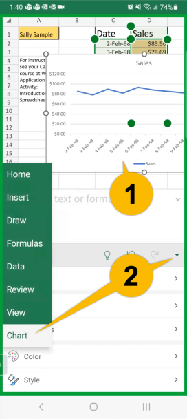
- If needed, open the main menu and tap on "Chart."
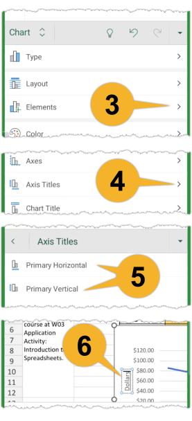
- Tap on the arrow in the "Elements" menu item.
- Tap on the arrow in the "Axis Titles" menu item.
- Tap "Primary Horizontal" and "Primary Vertical" in turn to add them to the chart.
- You can zoom in on the chart to edit the text boxes that appear.
- You can tap, hold, and drag the chart to position it on the spreadsheet.
- You can also resize the chart. Tap on it once to activate the circles on every corner. Tap, hold, and drag a corner to resize.
